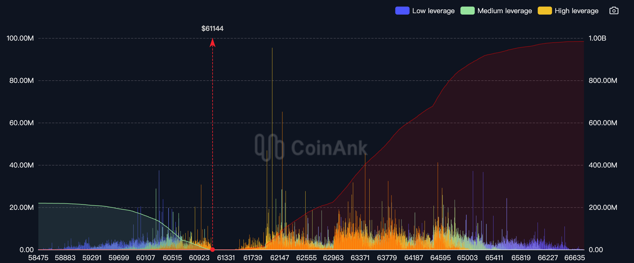
The liquidation map and liquidation map allow market traders to chart leverage liquidation, which means predicting price behavior based on the stock of leverage positions in the cycle and the distribution of long and short positions at different prices, and then quantifying the liquidation intensity of the long and short sides.
When the long and short combinations of different leverages within the time period are displayed on the picture as liquidation clusters at regional prices, the denser the cluster, the greater the liquidation intensity. Here is what happens when traders trade on unregulated cryptocurrency derivatives exchanges. The risk of being exposed all the time is the risk of liquidation (explosion). When the liquidation price is triggered, the trader's position will be forcibly closed by the exchange's risk engine. Small positions will have little impact on the price and market, but liquidation clusters are positions at similar prices. Once liquidated, it will create a terrible situation. "Chain reaction", because when positions at certain key points are liquidated, they are traded at market prices. This will accelerate the price push and cause more nearby positions to be liquidated, which will have a greater impact on the price. At this time, the price Large fluctuations are the big liquidity that the main players like, and it is easier for the main institutions to enter the market with large orders.

What do the two axes represent?
The X-axis represents the bid price, and the Y-axis represents the relative strength of liquidations. The columns on the liquidation chart actually show the importance or strength of each liquidation cluster relative to adjacent liquidation clusters, not the precise number of contracts to be liquidated or the value of the contracts. Therefore, the liquidation chart shows what will happen when the underlying price reaches a certain position. To what extent is it affected. Higher "clearing bars" indicate stronger liquidation
Note: The different colors are only for the user to distinguish between different liquidation clusters
Using the liquidation map you can:
- Breakout trading - Profitable scalping
- Refer to the points for setting stop losses
- Take profits in areas of high liquidity
- Enter large positions to create liquidity and avoid unnecessary slippage
- Gradient according to the intensity of liquidation Predict price fluctuations
